For the traduction of telefang 1 we need a new logo
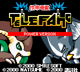
here's the actual version of this logo, the picture is from the latest V54 patch.
I vectorised it, if it interest you, I can give you the file
(for people who don't know what vectors are: here is the Wikipedia page )
here is the picture:

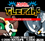
here is the original japanese logo:
I think the new english logo must be ameliored,
I don't know but i find it hard to read (what i mean is, it isn't easy enough)
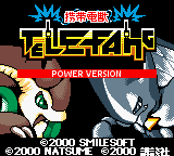
I tried editing it for a better version:

I think it's better but we can make it even better,
have you got any ideas how to improve it ?
do you think it's good as it is ?
please give your suggestions.
For those who misunderstand, I'm tryng to help, not to annoy.
Here's a new version: