I don't know why people equate "dead-straight and boring" with "official-looking", except that maybe we've gotten used to official logos looking lame.
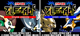
If you look at logos for stuff like Pokémon they definitely make them more interesting by having the letters different sizes/levels. Another example would be the original Digimon logo with the jaggy letters and monster face in it.
I don't want to offend anyone, but my strong personal feeling is that the logo is getting less cool and iconic with each new rendition!
