Page 4 of 7
Re: Telefang 1 english logo
Posted: Mon May 30, 2011 12:26 pm
by andwhyisit
Kimbles wrote:I guess I'm still kind of lost on what you think Denjuu translates to...?
It's a contraction. It's like how "Mobile" is a contraction of "Mobile Phone" despite how the word "mobile" literally means "able to move or be moved freely or easily".
So in this case a shortened version of "Mobile Phone-Beasts" such as "Phone-Beasts" or anything similar would be more appropriate in my opinion.
Re: Telefang 1 english logo
Posted: Mon May 30, 2011 12:29 pm
by Diamond(imported)
wrote:So in this case a shortened version of "Mobile Phone-Beasts" such as "Phone-Beasts" or anything similar would be more appropriate in my opinion.
I think "Mobile Phone-Beasts" is cooler.
"Phone-Beasts" hasn't got any spice ! ^_^
Re: Telefang 1 english logo
Posted: Mon May 30, 2011 12:29 pm
by andwhyisit
Kimbles wrote:Well, cellular monsters always puts me in mind of monsters that are made of cells, which isn't the right idea... :/ Besides, Mobile Phone-Beast is about as close to the original pun as you're going to get, so what's the problem? :V
No problem at all. I was just throwing the idea out there, that's all. I didn't realise that you'd already considered it.
Kimbles wrote:I shouldn't have brought this up at all... *sigh* Anyway, I only gave that line as an example, and I'd still want to think about how to word it before actually putting it in, so you don't need to get so upset... D: "Electric monsters known as Denjuu" is still a weird way of wording it, though, since it's just a translation. D: Like "cats known as Neko".
Sorry about that, I went a bit far there. Pay me no heed.
In regards to the text I can't think of anything better unfortunately.
Re: Telefang 1 english logo
Posted: Fri Jun 03, 2011 10:58 pm
by RacieB
I just want to add that this one,
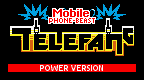
is totally the best! Seriously it makes me giddy just to look at it, it seems the closest to official imo.
As far as explaining what Denjuu means somewhere ingame, I don't really see why it would be necessary personally. It's easy enough to just take it as what the creatures are called. Now I'm pondering what an official localization would have gone with, probably Cellmon or something equally atrocious, looking at the trend of monster games at the time D:
Hmm.. speaking of, Mobile Beast might be the best contraction, punwise? They do an awful lot of traveling after all >>
Re: Telefang 1 english logo
Posted: Sat Jun 04, 2011 7:16 am
by kmeisthax
I'm still a bit unpleased with the positioning of the G. I understand it's because of the way OAM sprites are setup to avoid attribute clash, but it's still... off. The logo would probably look better if all the letters were on the same baseline.
I'm also disassembling the game looking for the titlescreen routines, so if I can find that I could possibly alter the sprite mapping and background tables so you can pull down that G. No guarantee that I'll find it, but hopefully I can.
Re: Telefang 1 english logo
Posted: Sat Jun 04, 2011 7:29 am
by Sanqui
kmeisthax wrote:I'm still a bit unpleased with the positioning of the G. I understand it's because of the way OAM sprites are setup to avoid attribute clash, but it's still... off. The logo would probably look better if all the letters were on the same baseline.
I'm also disassembling the game looking for the titlescreen routines, so if I can find that I could possibly alter the sprite mapping and background tables so you can pull down that G. No guarantee that I'll find it, but hopefully I can.
We can edit tilemaps already, so yes, it would be possible to push the G down. (Well, dunno about sprites.) I'm not the one working on the logo though~ (seriously, I don't really mind either of these, so!)
Re: Telefang 1 english logo
Posted: Sat Jun 04, 2011 7:54 am
by Diamond(imported)
wrote:I'm still a bit unpleased with the positioning of the G. I understand it's because of the way OAM sprites are setup to avoid attribute clash, but it's still... off. The logo would probably look better if all the letters were on the same baseline.]
I feel the same, the G is strange.
Re: Telefang 1 english logo
Posted: Sat Jun 04, 2011 9:20 am
by RacieB
But it's evocative of the power antenna, adds balance with the T, and is visually more interesting than uniform letters :<
Re: Telefang 1 english logo
Posted: Sat Jun 04, 2011 10:26 am
by Diamond(imported)
I understand what you mean,
Maybe just put it a bit more bigger but not aligned,
well we will see what it's like,
it's not like it will be definitive.
if it's ugly we can always change back.
It's just to see what it could look like.
Re: Telefang 1 english logo
Posted: Sat Jun 04, 2011 10:44 am
by Kimbles(imported)
RacieB wrote:But it's evocative of the power antenna, adds balance with the T, and is visually more interesting than uniform letters :<
My thoughts exactly. XD
I guess we could try making it a bit longer (if that's possible?), but I think it looks good with the G on the same level as the T... *nod*