Re: Telefang 1 english logo

Discuss anything related to hacking ROMs of the Telefang games here.
Post Reply
Diamond(imported)
Posts: 56
Joined: Sat Dec 25, 2010 4:49 am

Re: Telefang 1 english logo

Post by Diamond(imported) »

Hello,
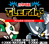
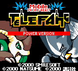
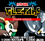
For the traduction of telefang 1 we need a new logo
Image
here's the actual version of this logo, the picture is from the latest V54 patch.

I vectorised it, if it interest you, I can give you the file
(for people who don't know what vectors are: here is the Wikipedia page )

here is the picture:

Image

here is the original japanese logo:
Image

I think the new english logo must be ameliored,
I don't know but i find it hard to read (what i mean is, it isn't easy enough)

I tried editing it for a better version:

Image

I think it's better but we can make it even better,

have you got any ideas how to improve it ?
do you think it's good as it is ?

please give your suggestions.

For those who misunderstand, I'm tryng to help, not to annoy.
Here's a new version:

Image
Kimbles(imported)
Posts: 470
Joined: Mon Dec 24, 2007 3:17 am

Re: Telefang 1 english logo

Post by Kimbles(imported) »

Thanks for starting this topic...XD I think that's a slight improvement actually, but it still looks weird with the EF bigger than the rest...*shrug*

Personally I think it would make more sense to just make our own logo from scratch, and not worry about making it match the lines of the original so much. *nod* If we could just make the EF the same size as the other letters though, I think this one would be fine too...XD If it ends up too small you could always make it appear bigger on the screen, too... The current logo in the patch takes up less space than the original, and I think it would look a lot better if it didn't. D: Not that I don't appreciate the effort that went into adding it to the patch, but we probably should have figured this out beforehand...? >_<;

Also, we really should figure out what we're doing with Keitai Denjuu. D: We either need to translate it (my vote goes to "Mobile Phone-Beast", or something similar) or take it out of the logo entirely (which would give us a lot more freedom in changing the rest of the logo). XD Either way, if we're translating the logo at all, it doesn't make any sense to leave the kanji there. :/
Diamond(imported)
Posts: 56
Joined: Sat Dec 25, 2010 4:49 am

Re: Telefang 1 english logo

Post by Diamond(imported) »

Well I was thinking about chaging the logo entirely but I thought people wouldn't want that,
The problem is that the only letters that can have phones integrated are "L" and "N"
wich leaves enormous space for the "EFA" but none to "te" and "g"

If we redo the logo from scratch, one thing we need to keep is the phones and the electricity.

Mobile phone-beast is a bit long,
maybe we should make it "Phone beasts, Telefang !"
but that makes it look like they are phone monsters, like phones with eyes and teeth :D

don't forget to give us your suggestions if you have some.
User avatar
andwhyisit
Site Admin
Posts: 1197
Joined: Fri Dec 14, 2007 9:24 pm

Re: Telefang 1 english logo

Post by andwhyisit »

Keep in mind that I have restrictions in place in regards to what I can or can't do in regards to the logo.

Please by tell me that this is at least acceptable to you:
Image

Now I may sound a tad upset, but when you waste 7.5 hours on something and stay up until all hours but receive nothing but complaints (despite the fact that no-one directed these complaints at the vector wikifang logo or RacieB's english logo mockup before it, which exhibited the exact same traits), and furthermore outright state that you should spend another 7.5 hours making the logo from scratch "again", suggesting that your work has been a waste of time, then how would you react?
Kimbles wrote:The current logo in the patch takes up less space than the original, and I think it would look a lot better if it didn't. D:
If you want less variation in the height of letters then you cannot possibly do this without the letters looking ugly and stretched. Furthermore I cannot due to technical limitations. The best option is to reposition the "power version" box up by one tile, however I know not how to do this at the moment. But when I do figure that out I'll move the 'G' down by a tile.
Kimbles(imported)
Posts: 470
Joined: Mon Dec 24, 2007 3:17 am

Re: Telefang 1 english logo

Post by Kimbles(imported) »

andwhyisit wrote:Keep in mind that I have severe restrictions in place in regards to what I can or can't do in regards to the logo.
Mind explaining what those are? I'm curious how this works, and it might make things a bit easier... XD
wrote:Now I may sound a tad upset, but when you waste 7.5 hours on something and stay up until all hours but receive nothing but complaints (despite the fact that no-one directed these complaints at the vector wikifang logo or RacieB's english logo mockup before it, which exhibited the exact same traits), and furthermore outright state that you should spend another 7.5 hours making the logo from scratch "again", suggesting that your work has been a waste of time, then how would you react?
Well, I don't really know what to say. ._.; I figured that changing the logo would be something we'd discuss after we had most of the patch done, and that it'd be something we discussed before actually changing. D: I understand that you're upset, but we had no way of knowing you were spending 7.5 hours working on it until you posted the new version. This is why it's better to communicate! ;_; I'm sorry!

We could avoid stuff like this in the future if you could comment on what you're changing/working on beforehand, or hop on the IRC once in a while. *shrug* I swear we won't bite? ^^;

As for the logo, I like it, it's much easier to read like that. XD But I still think it could be improved. (sorry)
User avatar
andwhyisit
Site Admin
Posts: 1197
Joined: Fri Dec 14, 2007 9:24 pm

Re: Telefang 1 english logo

Post by andwhyisit »

Take a look at the original telefang logo. Every tile that houses part of the logo can be changed, whilest every tile that does not, can-not. The bottom row is full of holes.

This is just the main part of the logo, excluding the power version text, "Keitai Denjuu" text and phone signal.
Image
Red = Sprite
Blue = Tile
Yellow = Repeated tile
Green = Either cannot edit (repeated black tile) or not of the main part of the logo

All tiles use palette of white, yellow, orange, and black.
All sprites use palette of yellow, orange, and black in addition to a colour assigned to be transparent.

However as I said, should I find a way to rearrange where the tiles go I cannot add more tiles and the final result will either look ugly and stretched, or the letters will be all over the place in regards to letter height, width, placement, spacing or any combination of the four.

Here's my attempt at the "Keitai Denjuu" text in any case:
Image
What about this then:
Image

Image

Now just about everything is the same height. Although it doesn't look as much like the original logo now.
Minor Revision:
Image

Is this fine or am I going down the wrong track here?
Kimbles(imported)
Posts: 470
Joined: Mon Dec 24, 2007 3:17 am

Re: Telefang 1 english logo

Post by Kimbles(imported) »

andwhyisit wrote:Minor Revision:
Image
Oooh, I really like this one, actually. XD And the mobile phone-beast part looks awesome. :D
I think it looks more like an official logo like that, but I'm curious what everyone else thinks... XD
Blaziken257
Posts: 983
Joined: Fri Dec 22, 2006 11:52 am

Re: Telefang 1 english logo

Post by Blaziken257 »

I honestly like this new logo much better than the older one. Everything is all uniform and neat. Nice! As for the spacing between the logo and Power Version text, I suppose we'll all get used to that -- it's not like old Pokémon games don't do the same thing, after all. Yeah, I actually like this one now.

BTW, as a random point, the sprites are in different spots in Speed Version, to accommodate the Fungus/Gymnos tiles. It's not that obvious unless you view it in monochrome mode, where you see minor artifacts due to sprites being a bit brighter than background tiles.
Diamond(imported)
Posts: 56
Joined: Sat Dec 25, 2010 4:49 am

Re: Telefang 1 english logo

Post by Diamond(imported) »

Let's look at all the new logos:

Image

Image

Image

The new logo is so great !
I think we almost got it now !

I suggest that maybe we can take of a little bit of the space between at the top of the T and le E
so the T is more visible, we can also put the G a bit more down. (that is if you can)

wrote:Now I may sound a tad upset, but when you waste 7.5 hours on something and stay up until all hours but receive nothing but complaints (despite the fact that no-one directed these complaints at the vector wikifang logo or RacieB's english logo mockup before it, which exhibited the exact same traits), and furthermore outright state that you should spend another 7.5 hours making the logo from scratch "again", suggesting that your work has been a waste of time, then how would you react?
Sorry about that, I didn't think you will get upset,
I just wanted to help, because I know we could make it better.
KenjutheDenjuu(imported)
Posts: 458
Joined: Sun Dec 05, 2010 2:53 am

Re: Telefang 1 english logo

Post by KenjutheDenjuu(imported) »

I do like the straightened logo since it's kind of how the english logo might look if there had ever been an english version of the Telefang games. I'm guessing the reason the logo was sort of jagged before was because of the tile space restrictions? Also, I noticed you guys missed the word electric (from the 'den' in denjuu) in your title. Would it be better as Mobile Electric Beast Telefang, instead of Mobile Phone Beast Telefang? I just thought i'd suggest it since it wasn't mentioned, plus the Wikipedia article translates it as that.
Post Reply