This might be better:Kimbles wrote:
Hmm, how's this look for a compromise on the G? I just messed with it in paint so I don't know how well it would fit... :V

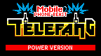

This might be better:Kimbles wrote:
Hmm, how's this look for a compromise on the G? I just messed with it in paint so I don't know how well it would fit... :V

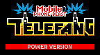
Did you used/made a specific font for the "mobile phone beast" thing? I'd need a font for that thing,i wanna translate this in italian when it's completedandwhyisit wrote:Take a look at the original telefang logo. Every tile that houses part of the logo can be changed, whilest every tile that does not, can-not. The bottom row is full of holes.
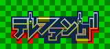
This is just the main part of the logo, excluding the power version text, "Keitai Denjuu" text and phone signal.
Red = Sprite
Blue = Tile
Yellow = Repeated tile
Green = Either cannot edit (repeated black tile) or not of the main part of the logo
All tiles use palette of white, yellow, orange, and black.
All sprites use palette of yellow, orange, and black in addition to a colour assigned to be transparent.
However as I said, should I find a way to rearrange where the tiles go I cannot add more tiles and the final result will either look ugly and stretched, or the letters will be all over the place in regards to letter height, width, placement, spacing or any combination of the four.
Here's my attempt at the "Keitai Denjuu" text in any case:
What about this then:
Now just about everything is the same height. Although it doesn't look as much like the original logo now.
Minor Revision:
Is this fine or am I going down the wrong track here?
No. I pretty much winged it.telefangfan wrote:Did you used/made a specific font for the "mobile phone beast" thing? I'd need a font for that thing,i wanna translate this in italian when it's completed
We don't use fonts, we just draw the letters. Just open up mspaint and start drawing letters if you need some practice.telefangfan wrote:Then i'll search for a bi-color font or just makeing the "keitai denjuu" with 2 different colours
Hi. I know this post is ancient but I wanted to say thank you for creating this logo. 15 years later and it's still finding use.Diamond(imported) wrote: Sat May 28, 2011 4:54 pm Hello,
For the traduction of telefang 1 we need a new logo
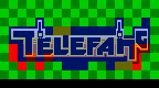
here's the actual version of this logo, the picture is from the latest V54 patch.
I vectorised it, if it interest you, I can give you the file
(for people who don't know what vectors are: here is the Wikipedia page )
here is the picture:
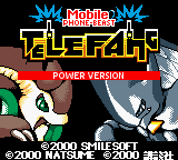
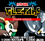
here is the original japanese logo:
I think the new english logo must be ameliored,
I don't know but i find it hard to read (what i mean is, it isn't easy enough)
I tried editing it for a better version:
I think it's better but we can make it even better,
have you got any ideas how to improve it ?
do you think it's good as it is ?
please give your suggestions.
For those who misunderstand, I'm tryng to help, not to annoy.
Here's a new version: